Techwork
Powering Stronger Connections
When Techwork approached us, their mission was clear — to strengthen the network that keeps our world connected. As a company specializing in battery maintenance and power systems for communication towers, they needed a brand that reflects reliability, strength, and innovation.
The Challenge
Techwork’s previous identity didn’t fully capture the scale of their impact. Their work powers the unseen — the energy behind every signal, call, and connection. Our challenge was to visualize that power and translate it into a brand system that feels both technical and human.
The Direction
We built the visual direction around two main ideas — power and connection.
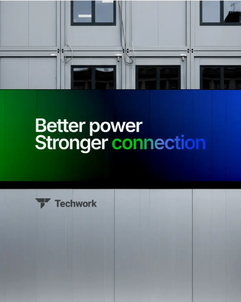
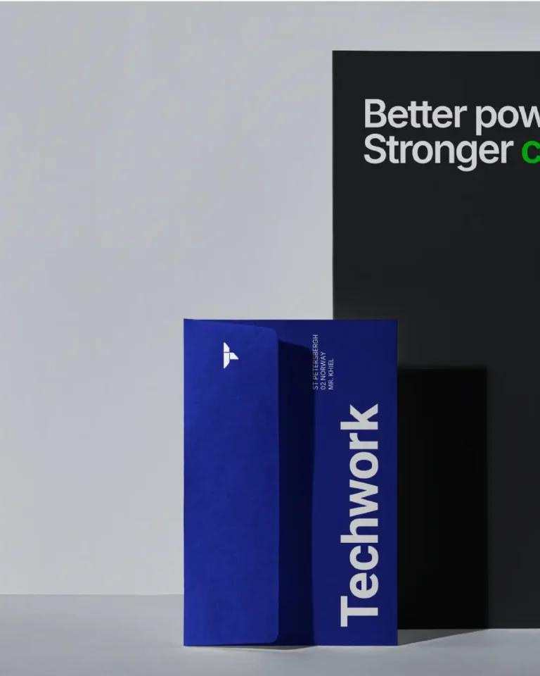
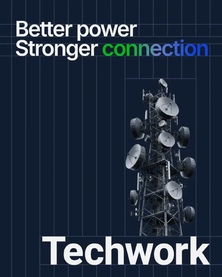
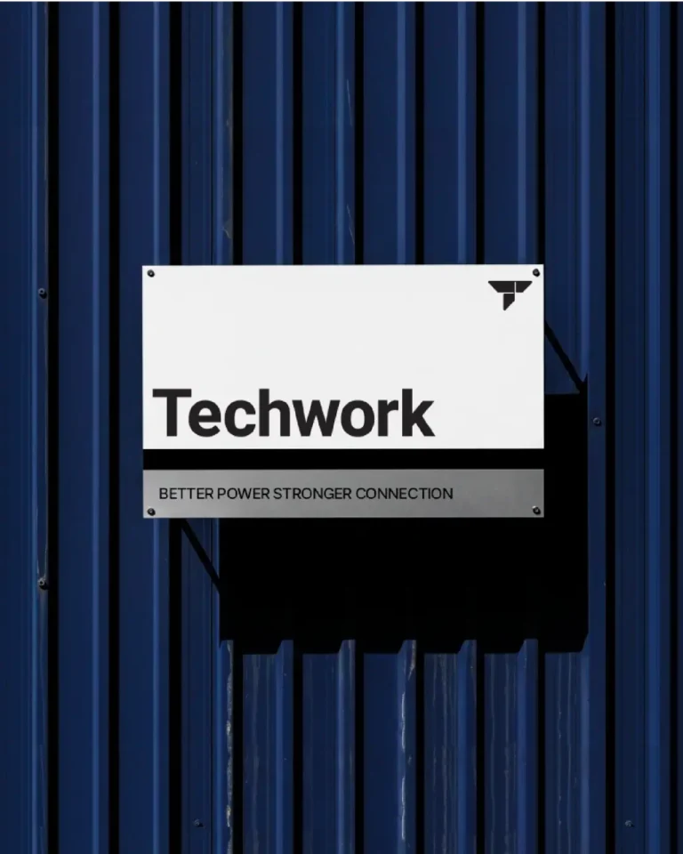
The tagline “Better power, Stronger connection” became the brand’s heartbeat. It communicates their promise in just a few words — efficient energy that leads to dependable connectivity.
The Visual Identity
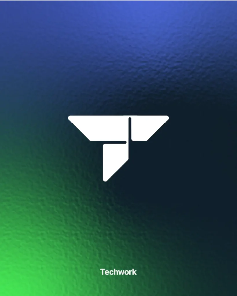
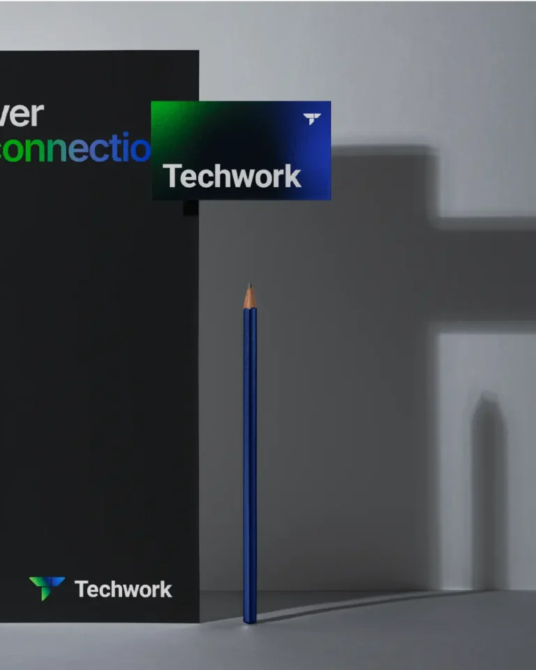
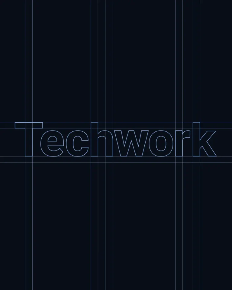
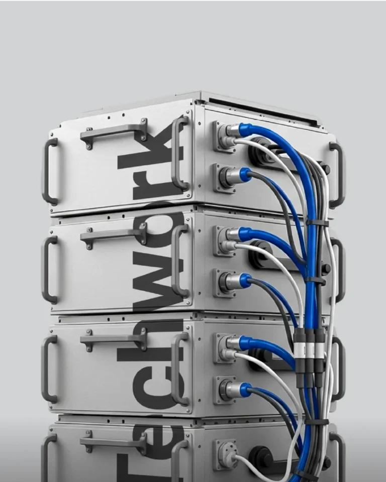
We combined deep navy tones with a gradient of blue and green, symbolizing energy flow and signal strength. The typography is bold and modern, designed for clarity and recognition across industrial surfaces and digital screens.
The grid background structure gives the brand a sense of precision and technical discipline — echoing the systematic nature of tower engineering and battery maintenance.
The Logo
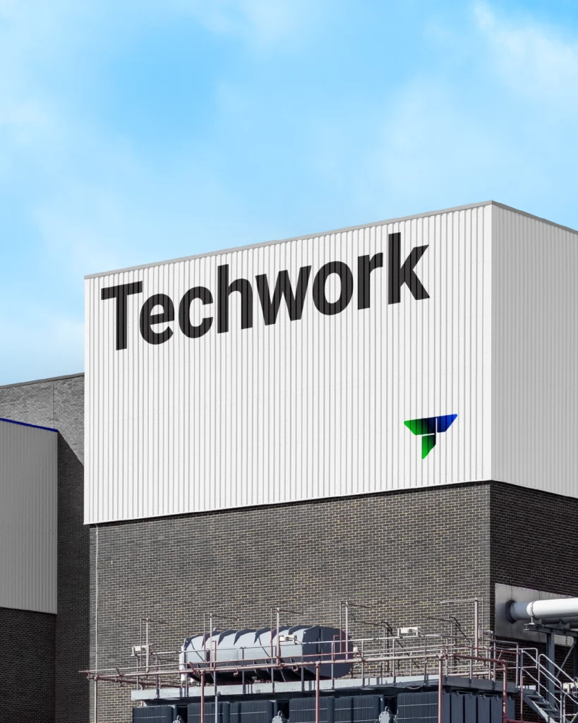
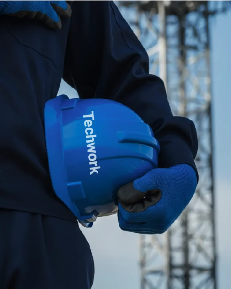
The new Techwork mark reflects structure, direction, and strength. It’s simple yet firm — a visual representation of stability and motion, designed to stand tall on every site, document, and vehicle.
The Outcome
The new identity positions Techwork as more than just a maintenance provider — it frames them as an essential part of the communication ecosystem. With visuals that speak energy, structure, and progress, Techwork’s brand now connects seamlessly with its purpose — to keep every signal strong and every connection alive.


