Saber Cleaner
Holisticly parallel task visionary value after wireless alignments.


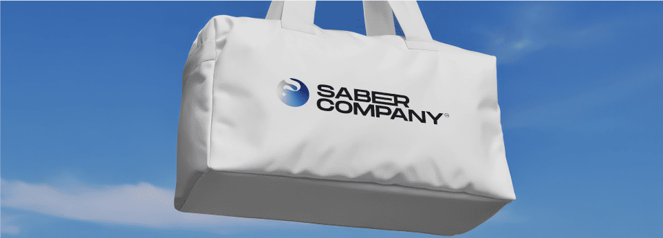
A clarity-driven brand that makes every surface shine again.
Saber is a high-performance glass cleaning brand created to redefine how we see cleanliness, literally. Designed for those who demand spotless precision, Saber brings together powerful formulation and refined aesthetics to transform a simple cleaning task into a ritual of clarity.
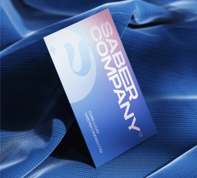
Brand Concept
The name Saber represents both sharpness and clarity cutting through fog, grease, and dullness. Inspired by vapor, smoke, and light refraction, the identity captures the transition from blur to brilliance, the same transformation Saber delivers on every glass surface.
Logo & Symbol
The Saber logo blends a soft vapor swirl forming the letter S, paired with a subtle shine accent symbolizing purity and the moment light hits a freshly cleaned surface. It’s modern, fluid, and memorable perfectly aligned with the brand’s promise of “clarity in every wipe.”
Visual Direction
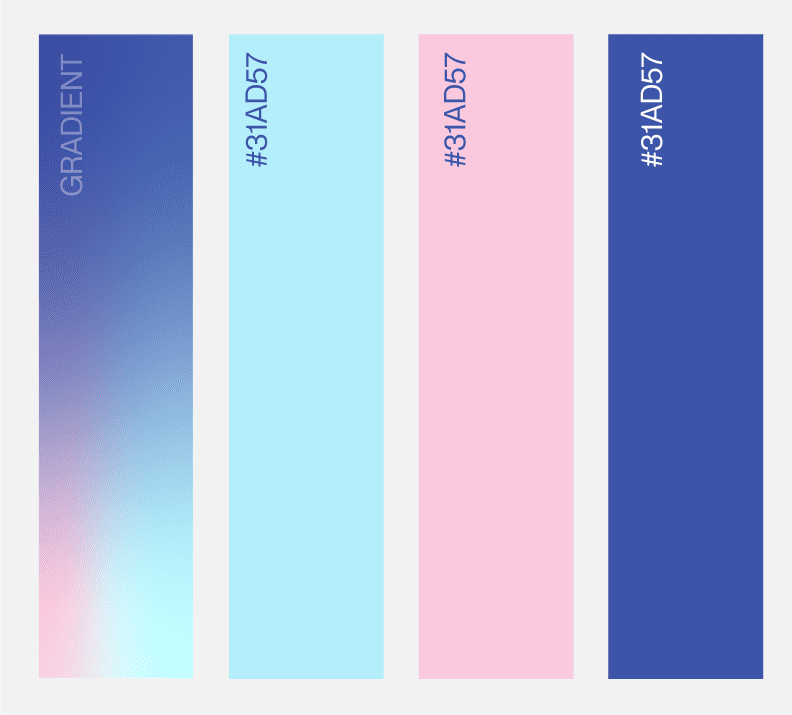
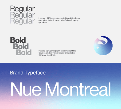
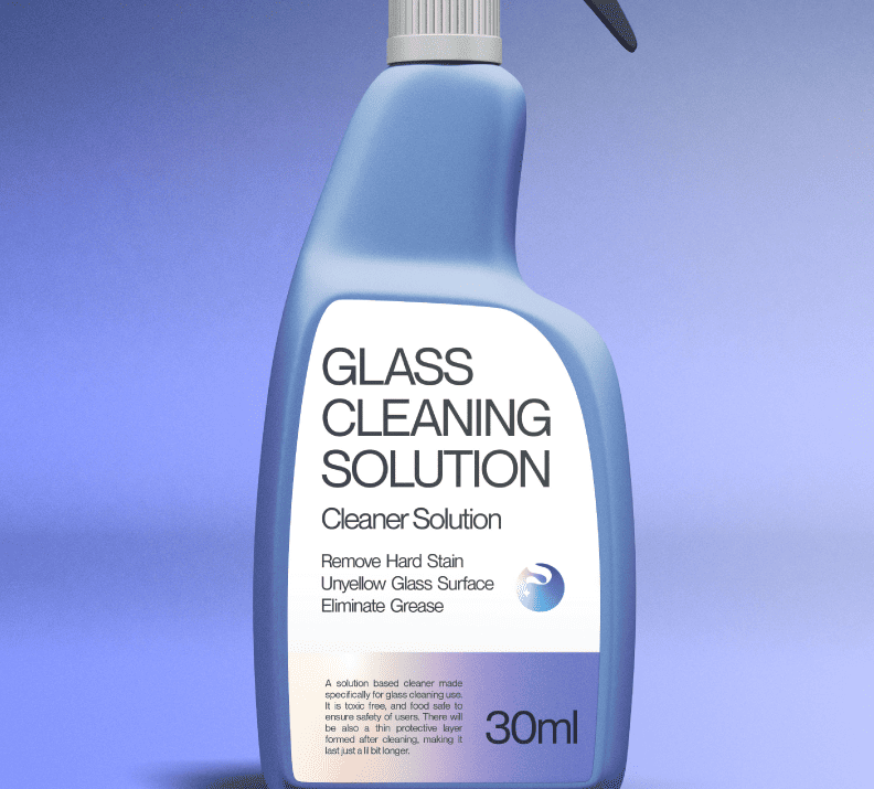
The visual system uses gradient hues of blue and white, creating a clean and cool feeling like mist clearing on a window. Typography is bold and structured, contrasting the airy graphics with precision and strength. The overall look captures both science and simplicity the two pillars of Saber’s brand DNA.
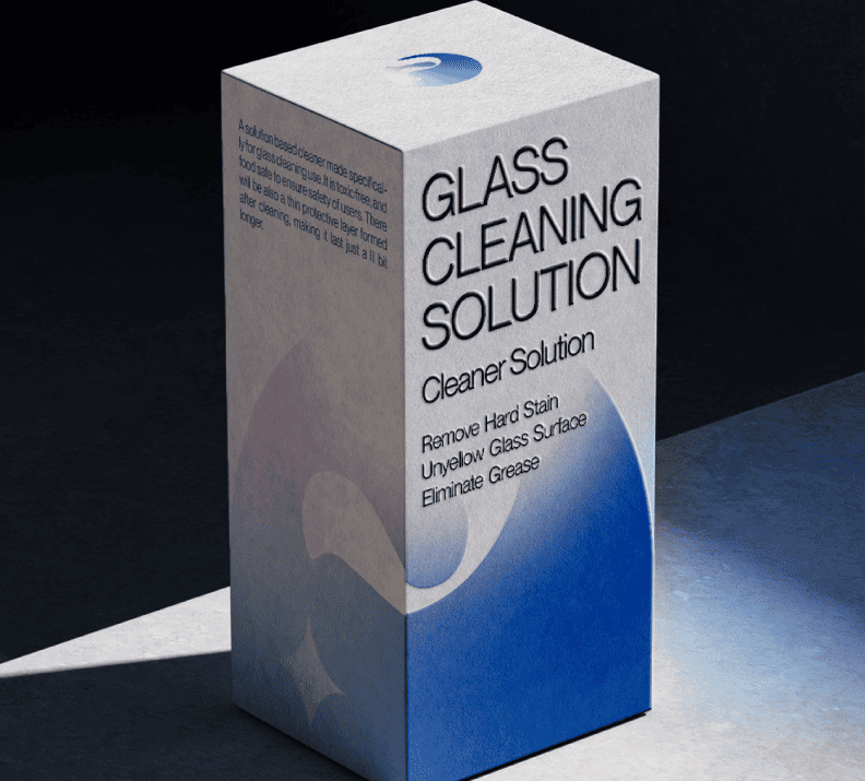
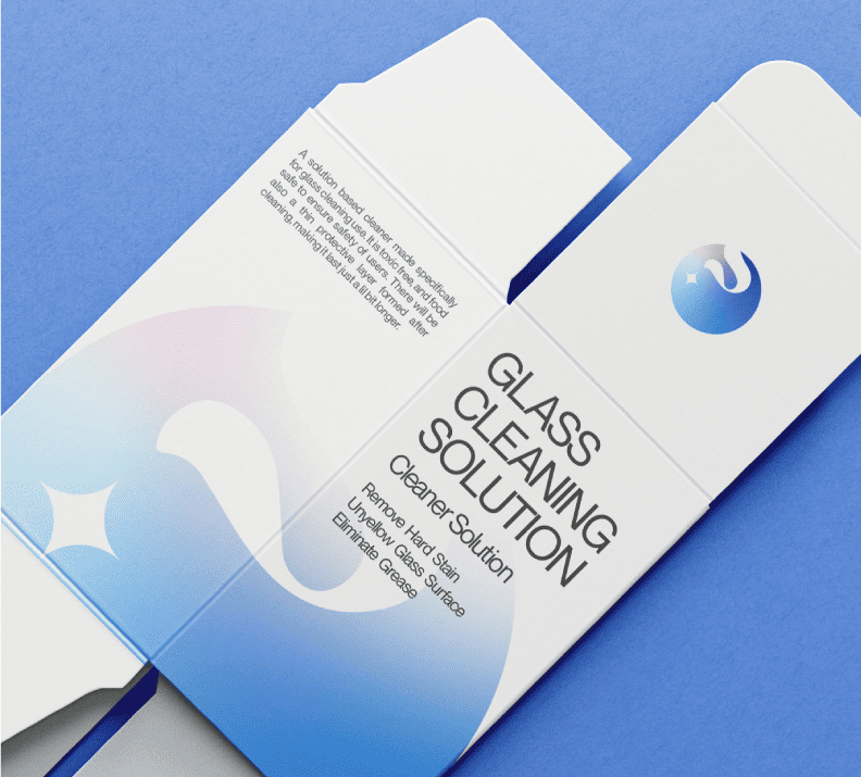
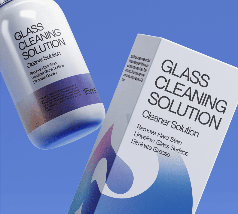
Packaging Design
Each packaging design reflects minimalism with purpose. The gradient wraps around the surface to mirror the smooth fade of fog, while the clean black typography ensures legibility and confidence. The result: a shelf presence that feels both technical and premium.
Brand Tone
Confident yet refined Saber speaks to professionals and meticulous home users alike. The tone focuses on clarity, performance, and design, avoiding loud claims and embracing quiet precision.

Outcome
Saber achieves what most cleaning products overlook a sense of design sophistication in a functional category. It doesn’t just clean glass it elevates the experience of clarity.


