Bold Branding with a Flavorful Twist: Opi Fried Chicken
At our design agency, we believe that branding should do more than just look good — it should tell a story, spark curiosity, and stick in people’s minds. Recently, we had the pleasure of working with Opi Fried Chicken, a growing food brand that wanted to bring their fun, flavorful personality to life through design.
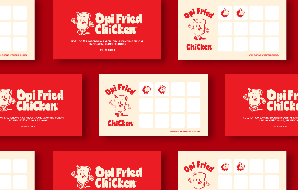
Playful Yet Bold Identity
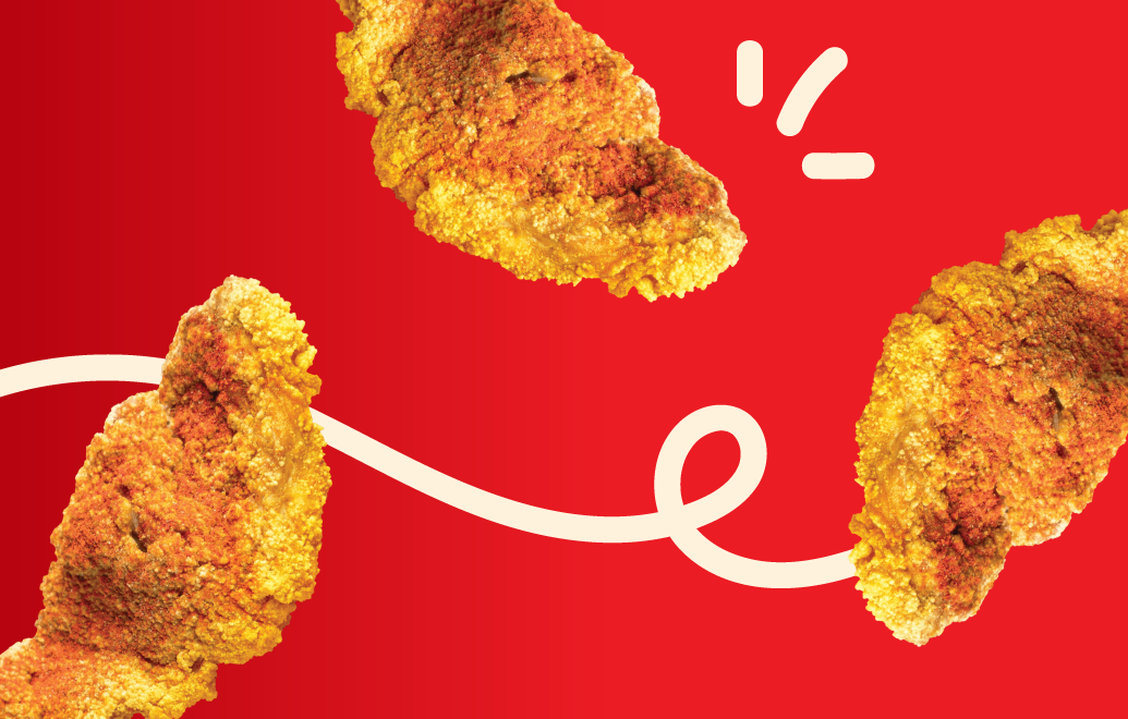
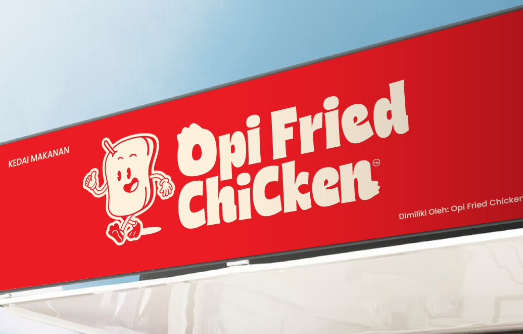
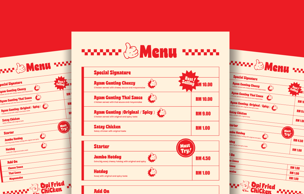
For Opi Fried Chicken, we created a visual identity that’s instantly recognizable and radiates energy. The red background conveys appetite and excitement, while the bold typography ensures strong brand recall. The slightly quirky lettering style reflects Opi’s approachable and fun brand character — making the name stand out whether it’s on storefront signage, packaging, or digital campaigns.
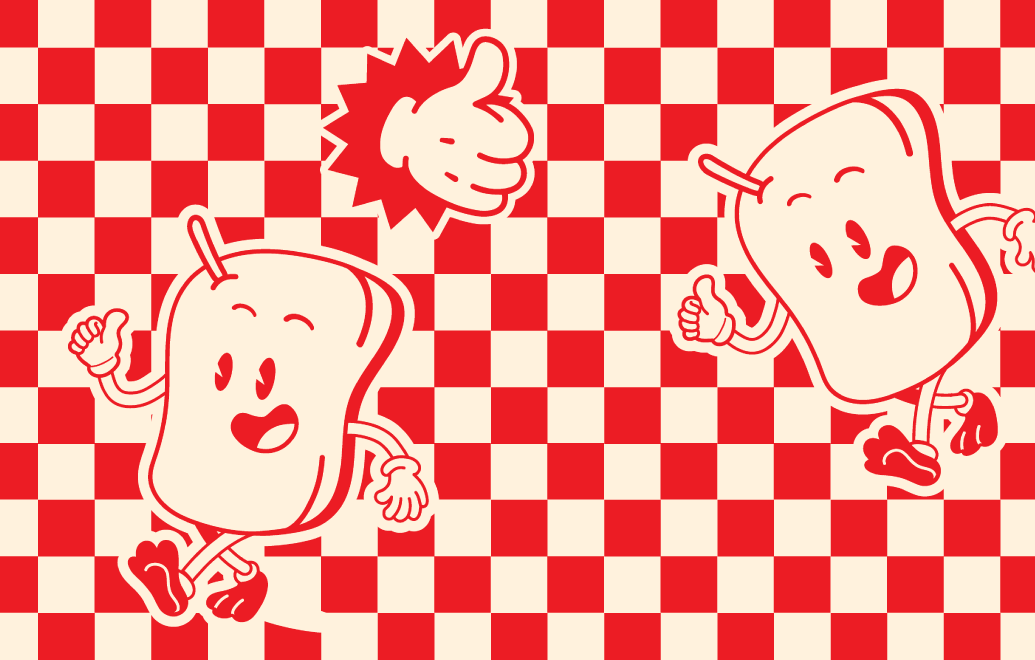
Character-Led Branding
What makes this brand identity special is the mascot design. We crafted a cheerful, walking fried chicken character that embodies warmth and friendliness. This character doesn’t just add visual appeal — it builds relatability and creates a sense of personality for the brand. It becomes something customers can remember, share, and connect with.
Local Flavor, Loud and Clear
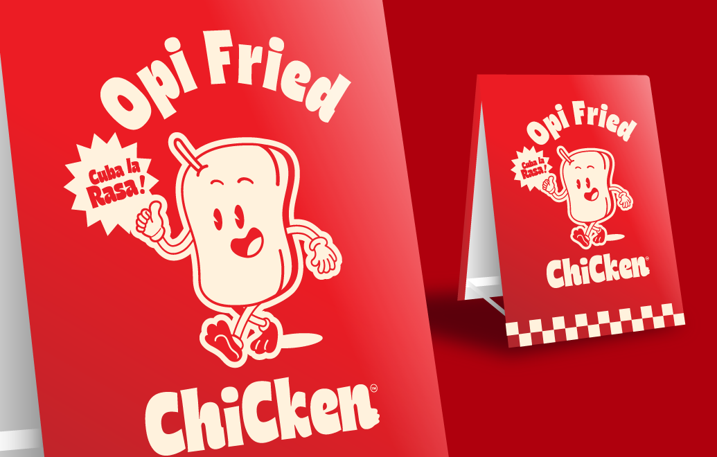
The tagline “Cuba la Rasa!” (“Try the Taste!”) gives the brand a local, authentic voice. By integrating regional language, the design doesn’t just promote the food — it invites the community to be part of the experience.
Designed for Impact
From the floor signage mockups to marketing materials, every design element was built with practicality and visibility in mind. The clean layouts, bold red gradients, and checkerboard accents ensure that Opi Fried Chicken stands out in busy, competitive environments.
Branding That Works
A great food brand should feel delicious before you even take the first bite — and that’s what we set out to achieve with Opi Fried Chicken. Through playful design, bold visuals, and a touch of local culture, the brand is now equipped with an identity that doesn’t just sell fried chicken — it sells an experience.