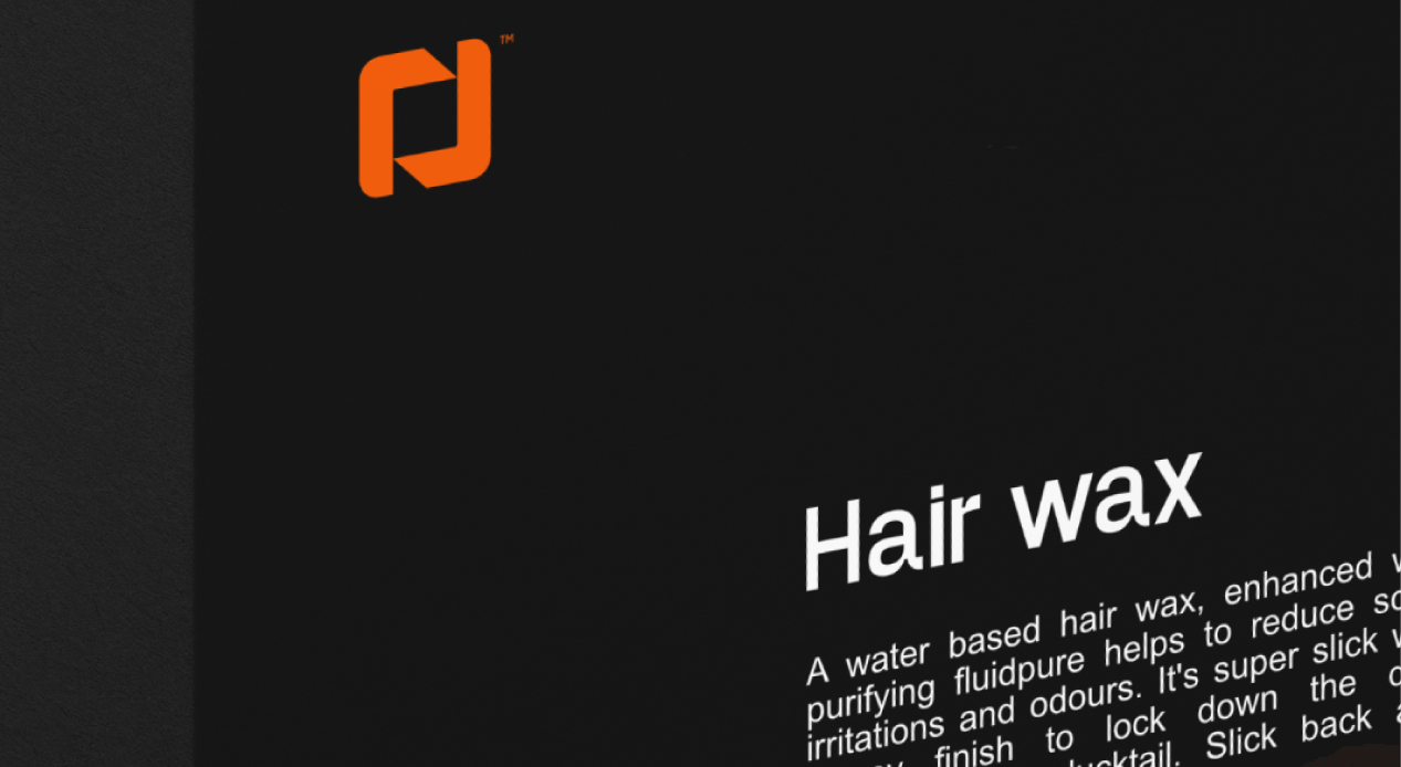
When creating the brand identity for Odyssey Hair Wax, the goal was to craft a look that speaks to confidence, style, and modern masculinity. The design balances boldness with simplicity, making it stand out on the shelf while staying relevant to today’s grooming market.
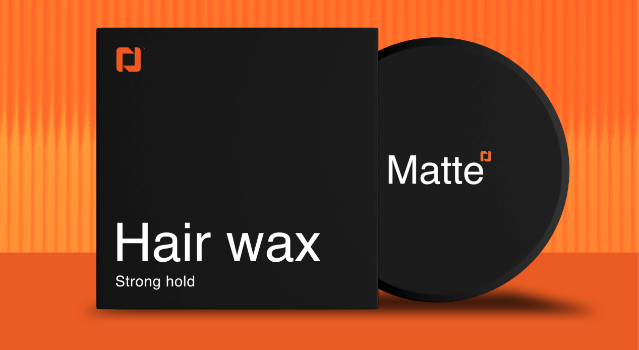
The color palette is a striking combination of deep black and vibrant orange. Black forms the strong foundation—conveying power, sophistication, and durability—while orange adds an energetic spark, symbolizing creativity and bold self-expression. This duo creates a memorable contrast that appeals to the adventurous yet style-conscious audience.
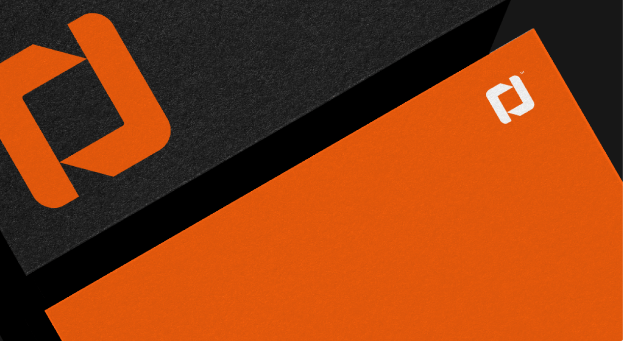
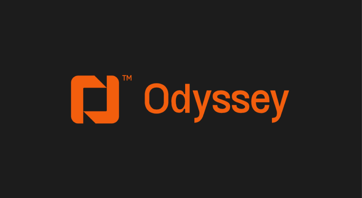
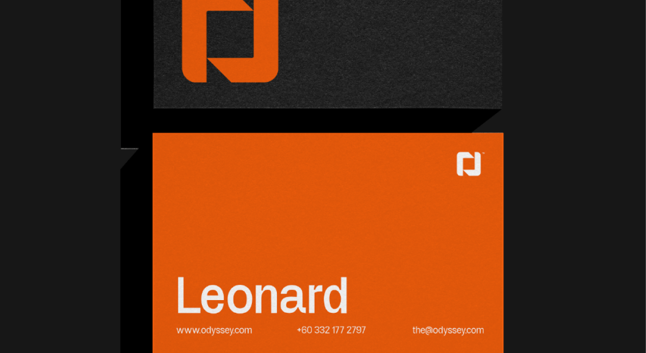
The packaging design features a black base box, giving the product a premium, sleek appearance. To highlight the brand’s modern edge, the logo is a stylized “O”, designed with a contemporary touch that reflects both minimalism and impact. The clean lines ensure versatility across applications, whether on packaging, digital platforms, or promotional materials.
Odyssey’s brand direction is inspired by the idea of a journey—an exploration of personal style and identity. Just as the name suggests, every user’s styling routine becomes part of their own odyssey. The design helps communicate this narrative, positioning the product as more than just hair wax, but a tool for confidence and self-expression.
This project demonstrates how a carefully chosen color palette, minimalist logo, and thoughtful packaging design can elevate a grooming brand into a modern, market-ready identity.