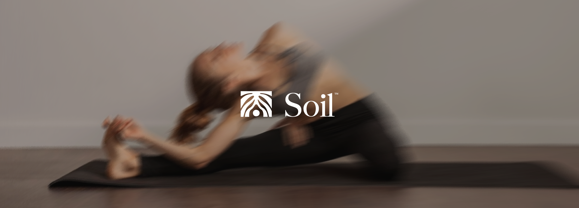
Soil Wellness Club : Grounded in Balance
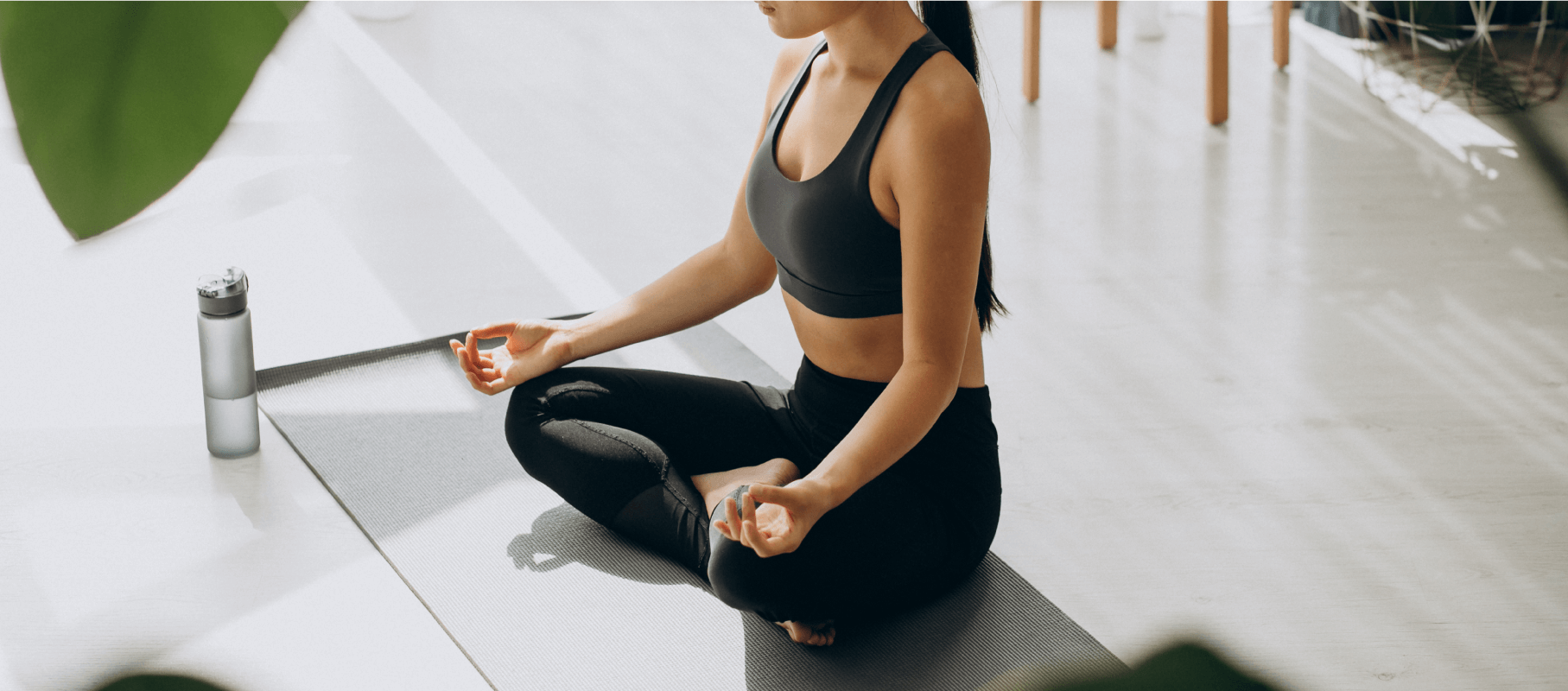
Soil Wellness Club came to us with a clear vision to create a space in Kerinchi where people could slow down, breathe, and reconnect with themselves through yoga and wellness practices. More than just a studio, they wanted a brand that felt like home for the body and mind grounded, calm, and connected to nature.
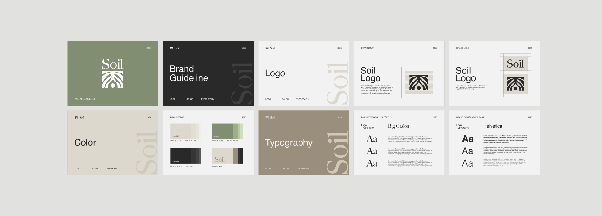
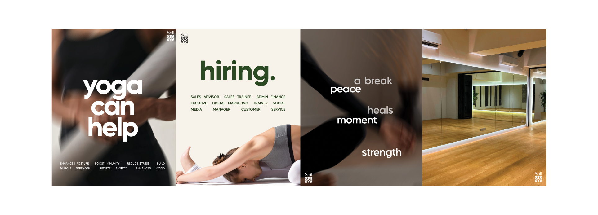
At Moreday, we translated that vision into a brand identity rooted in the earth itself. The palette draws from natural tones, olive green for growth and renewal, soft grey for balance, and warm brown for stability. These colors create a sense of warmth and grounding the moment you see them, perfectly mirroring the feeling of stepping into their studio.
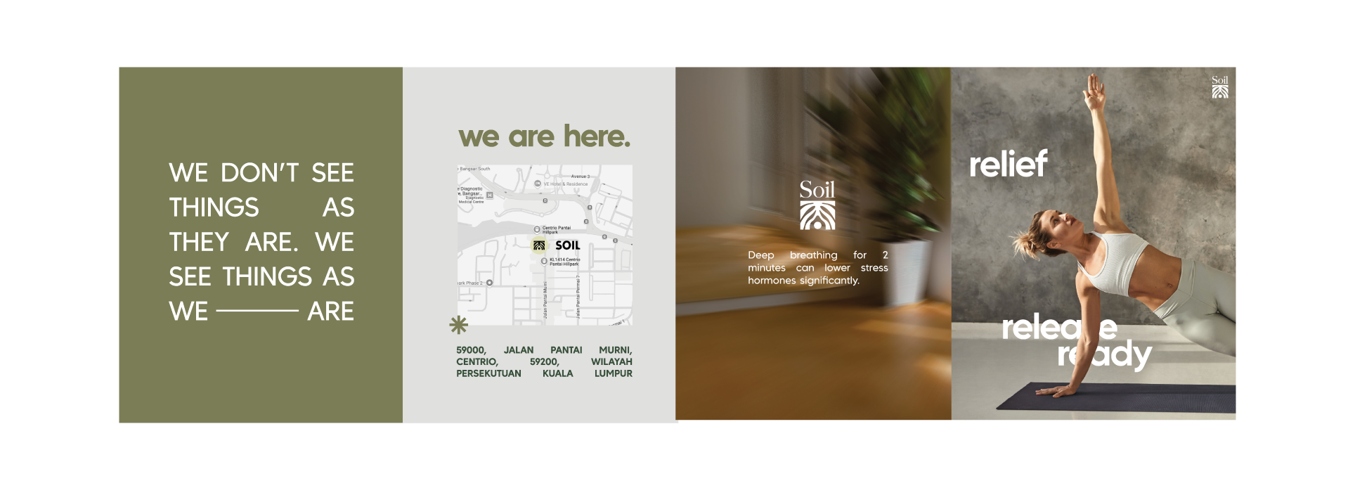
The logo a set of intertwined roots became the heart of the brand. It’s a symbol of connection: to the ground beneath us, to the people around us, and to our own inner strength. We kept the design minimal but organic, so it works beautifully on everything from signage to yoga mats. From the way their name is typeset to the textures we used in their materials, every design choice was intentional.
It reflects Soil Wellness Club’s philosophy: true wellness comes from being deeply rooted yet open to growth.
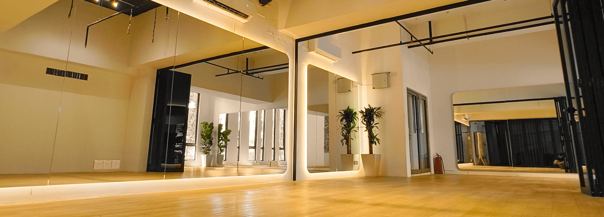
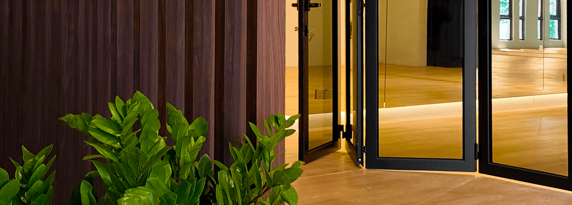
Now, as their Kerinchi studio welcomes students into its serene space, the brand serves as a visual reminder that wellness isn’t just a practice it’s a way of being. And it all starts from the ground up.